
Localized Widget Design for Yahoo Mobile Homepage
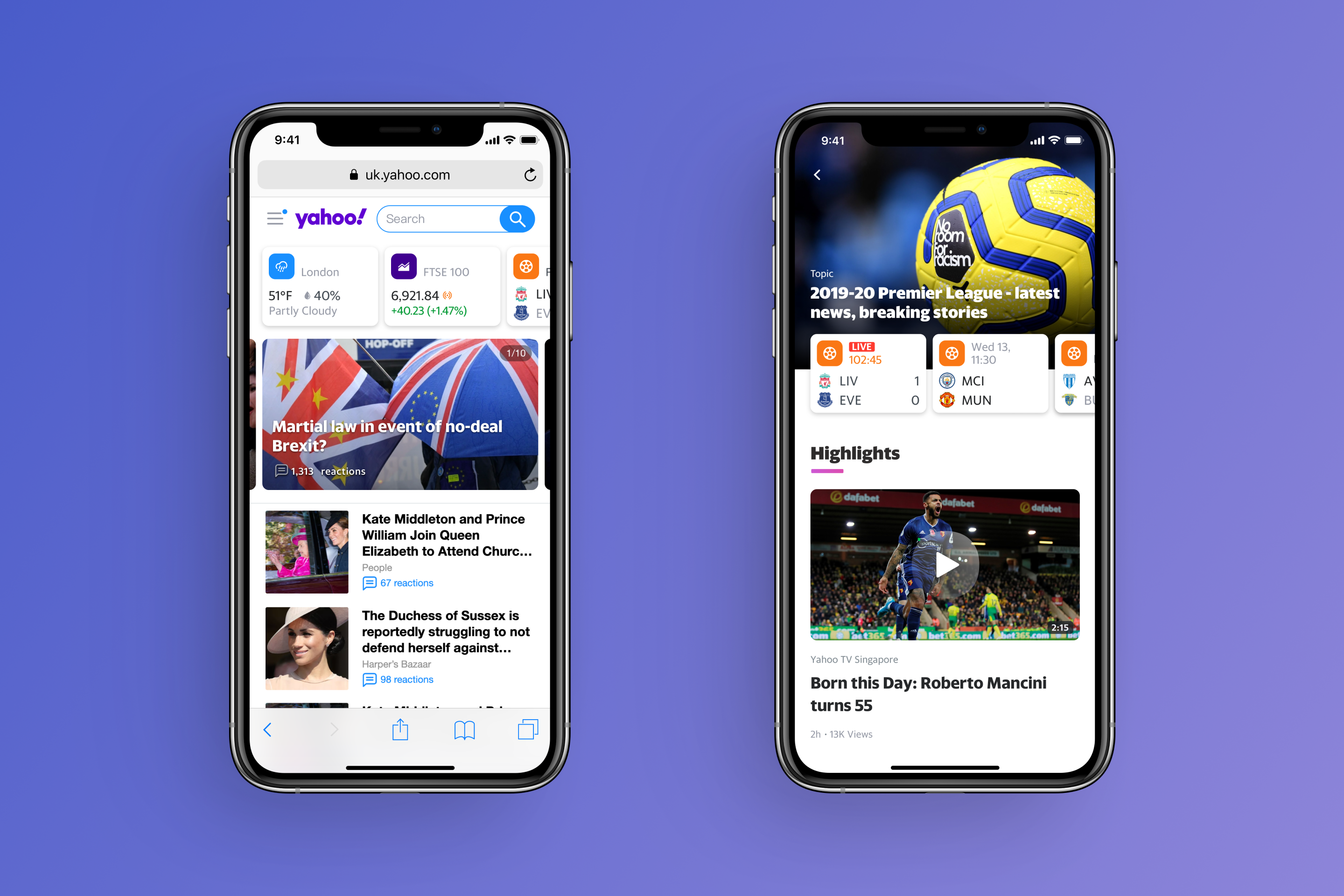
Redesigned Yahoo mobile web homepage for international markets with a scalable widget system tailored to local user behaviors and content needs, increasing engagement and daily usage.
Overview
Redesigned Yahoo’s international mobile web homepage by rethinking content hierarchy and positioning it as a daily entry point for essential information. A scalable widget system was introduced to support both global consistency and local needs.
The solution was informed by user research and collaboration with regional product managers, and rolled out across more than 10 international markets, strengthening user engagement and driving product growth.
My Role
- Supported early-stage user research by participating in user interviews and creating interactive prototypes for concept validation.
- Led the end-to-end design of the widget system, including design strategy, information architecture, design specifications, and final visual assets. Owned the initial global launch as well as subsequent localization and regional optimizations.
Background
The Taipei-based product team was responsible for the international version of Yahoo’s mobile web homepage. At the time, this product had not been actively maintained for years and was significantly more lightweight and limited compared to the U.S. version.
Despite its simplicity, the international homepage served as a critical entry point for daily content consumption across multiple regions. However, user numbers in several markets had been steadily declining, revealing clear limitations in both content presentation and long-term engagement.
This redesign initiative aimed to uncover new growth opportunities by rethinking how Yahoo’s diverse content could better support local user behaviors. Through user research and system-level design exploration, the team sought to identify scalable solutions that could drive engagement and support user growth across international markets.
Target regions included the UK, Australia, Brazil, India, and other international markets.
Goal
- Understand local user habits across international markets and optimize the mobile homepage to better support regional content needs and usage patterns.
- From a business perspective, improve homepage stickiness and drive sustainable growth in Daily Active Users (DAU).
Design Hypothesis
We hypothesized that the international mobile homepage could play a stronger role as a daily entry point if essential, frequently checked information were surfaced earlier and more clearly.
By improving the hierarchy and visibility of key content, we believed users would be more likely to engage with the homepage beyond their initial visit and navigate to other Yahoo services naturally.
Research Approach
To explore how different homepage structures and information priorities might affect user engagement across international markets, we designed a set of qualitative research activities focused on content hierarchy and daily information needs.
In-person research was conducted in the UK and Australia, with interviews and testing sessions involving 16 local users.
Homepage structure exploration
We proposed two homepage design concepts to evaluate different approaches to information presentation.
Concept A introduced a set of widget modules directly below the header to surface quick, up-to-date information, followed by a fully linear news feed.
Concept B emphasized a greeting and weather section at the top and organized news content into categorized sections such as Finance, Sports, and International.
These two concepts were used to understand how users perceived content accessibility, hierarchy, and overall readability, and which structure better aligned with their browsing habits.
Concept A: Utility-first, linear content flow
Concept B: Greeting-led, category-based structure
Widget preference exploration
In parallel, we explored user preferences for different types of widgets. We selected nine common Yahoo content types and translated them into widget concepts. Using a card-sorting exercise, participants were asked to rank these widgets based on usefulness and explain the reasoning behind their choices.
This helped us identify which types of information users considered most valuable in their daily routines, and why certain content needed to be surfaced more prominently on the homepage.
We used a card-sorting method to understand users’ preferences and perceptions of different widget concepts.
Research Findings
Prototype testing and interviews showed a clear preference for Concept A. Users valued being able to access essential, frequently checked information immediately upon landing on the homepage, without having to decide where to start.
Many participants described Yahoo as a place to quickly scan major stories and stay informed. The linear news feed in Concept A felt faster and more intuitive, allowing users to move through content seamlessly without switching between categories.
Across both concepts, users responded positively to the widget idea itself. Utility-driven widgets, particularly Weather, Finance, Sports, and Traffic, were consistently ranked as the most valuable for daily use. Based on these findings, these widgets became the first set launched globally, followed by additional region-specific widgets in later iterations.
Design Outcome
Based on research insights, I defined three core design principles: Immediate, Prioritized, and Not Disturb. These principles guided the widget design to ensure timely delivery of information, highlight essential content, and avoid disrupting the user’s browsing flow.
The initial version of the homepage and widgets launched with three core functions: weather, finance, and sports, all available globally. In addition, localized tools like lottery results and cricket scores were developed for markets such as the UK and India.
Expanding for Local and Personalized Needs
As user needs continued to evolve, we introduced additional tools tailored to specific preferences. For example, subway information was added for London and Sydney, helping users check commuting routes and real-time updates. We also launched horoscope widgets for broader regional engagement.
As the number and variety of widgets grew, we explored whether users needed the ability to customize their widget order. We proposed solutions to improve usage efficiency and developed different user flow recommendations. I also created flowcharts to help the team understand real-world contexts and improve communication.
Visual Spec Delivery
Impact
Following the launch in early 2019, the redesigned international mobile homepage delivered measurable gains in user engagement and platform growth, and informed similar design directions adopted by the U.S. team.
33%
YoY increase in Mobile DAU
8%
Increase in Homepage MAU

Back to Top


© 2025 Mason Chang.
Localized Widget Design for Yahoo Mobile Homepage
Redesigned Yahoo mobile web homepage for international markets with a scalable widget system tailored to local user behaviors and content needs, increasing engagement and daily usage.
Overview
Redesigned Yahoo’s international mobile web homepage by rethinking content hierarchy and positioning it as a daily entry point for essential information. A scalable widget system was introduced to support both global consistency and local needs.
The solution was informed by user research and collaboration with regional product managers, and rolled out across more than 10 international markets, strengthening user engagement and driving product growth.
My Role
- Supported early-stage user research by participating in user interviews and creating interactive prototypes for concept validation.
- Led the end-to-end design of the widget system, including design strategy, information architecture, design specifications, and final visual assets. Owned the initial global launch as well as subsequent localization and regional optimizations.
Background
The Taipei-based product team was responsible for the international version of Yahoo’s mobile web homepage. At the time, this product had not been actively maintained for years and was significantly more lightweight and limited compared to the U.S. version.
Despite its simplicity, the international homepage served as a critical entry point for daily content consumption across multiple regions. However, user numbers in several markets had been steadily declining, revealing clear limitations in both content presentation and long-term engagement.
This redesign initiative aimed to uncover new growth opportunities by rethinking how Yahoo’s diverse content could better support local user behaviors. Through user research and system-level design exploration, the team sought to identify scalable solutions that could drive engagement and support user growth across international markets.
Target regions included the UK, Australia, Brazil, India, and other international markets.
Goal
- Understand local user habits across international markets and optimize the mobile homepage to better support regional content needs and usage patterns.
- From a business perspective, improve homepage stickiness and drive sustainable growth in Daily Active Users (DAU).
Design Hypothesis
We hypothesized that the international mobile homepage could play a stronger role as a daily entry point if essential, frequently checked information were surfaced earlier and more clearly.
By improving the hierarchy and visibility of key content, we believed users would be more likely to engage with the homepage beyond their initial visit and navigate to other Yahoo services naturally.
Research Approach
To explore how different homepage structures and information priorities might affect user engagement across international markets, we designed a set of qualitative research activities focused on content hierarchy and daily information needs.
In-person research was conducted in the UK and Australia, with interviews and testing sessions involving 16 local users.
Homepage structure exploration
We proposed two homepage design concepts to evaluate different approaches to information presentation.
Concept A introduced a set of widget modules directly below the header to surface quick, up-to-date information, followed by a fully linear news feed.
Concept B emphasized a greeting and weather section at the top and organized news content into categorized sections such as Finance, Sports, and International.
These two concepts were used to understand how users perceived content accessibility, hierarchy, and overall readability, and which structure better aligned with their browsing habits.
Concept A: Utility-first, linear content flow
Concept B: Greeting-led, category-based structure
Widget preference exploration
In parallel, we explored user preferences for different types of widgets. We selected nine common Yahoo content types and translated them into widget concepts. Using a card-sorting exercise, participants were asked to rank these widgets based on usefulness and explain the reasoning behind their choices.
This helped us identify which types of information users considered most valuable in their daily routines, and why certain content needed to be surfaced more prominently on the homepage.
We used a card-sorting method to understand users’ preferences and perceptions of different widget concepts.
Research Findings
Prototype testing and interviews showed a clear preference for Concept A. Users valued being able to access essential, frequently checked information immediately upon landing on the homepage, without having to decide where to start.
Many participants described Yahoo as a place to quickly scan major stories and stay informed. The linear news feed in Concept A felt faster and more intuitive, allowing users to move through content seamlessly without switching between categories.
Across both concepts, users responded positively to the widget idea itself. Utility-driven widgets, particularly Weather, Finance, Sports, and Traffic, were consistently ranked as the most valuable for daily use. Based on these findings, these widgets became the first set launched globally, followed by additional region-specific widgets in later iterations.
Design Outcome
Based on research insights, I defined three core design principles: Immediate, Prioritized, and Not Disturb. These principles guided the widget design to ensure timely delivery of information, highlight essential content, and avoid disrupting the user’s browsing flow.
The initial version of the homepage and widgets launched with three core functions: weather, finance, and sports, all available globally. In addition, localized tools like lottery results and cricket scores were developed for markets such as the UK and India.
Expanding for Local and Personalized Needs
As user needs continued to evolve, we introduced additional tools tailored to specific preferences. For example, subway information was added for London and Sydney, helping users check commuting routes and real-time updates. We also launched horoscope widgets for broader regional engagement.
As the number and variety of widgets grew, we explored whether users needed the ability to customize their widget order. We proposed solutions to improve usage efficiency and developed different user flow recommendations. I also created flowcharts to help the team understand real-world contexts and improve communication.
Visual Spec Delivery
Impact
Following the launch in early 2019, the redesigned international mobile homepage delivered measurable gains in user engagement and platform growth, and informed similar design directions adopted by the U.S. team.
33%
YoY increase in Mobile DAU
8%
Increase in Homepage MAU

Back to Top
© 2026 Mason Chang. All Rights Reserved.