Revamping KKBOX’s Desktop App for Music Experience
Redesigned the desktop experience for KKBOX, a leading music streaming platform, with a new information architecture and unified design system to improve usability and visual consistency.
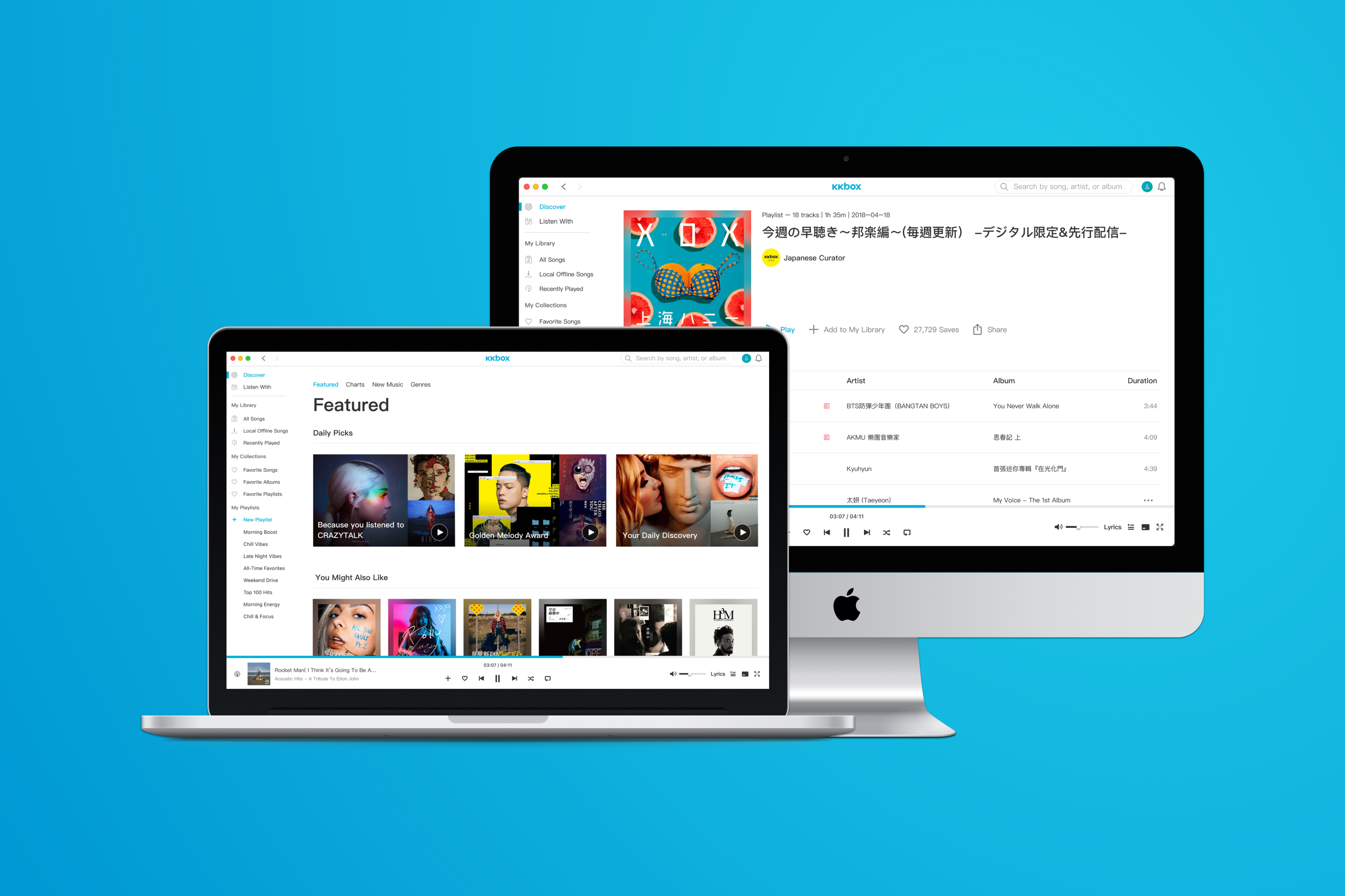
Overview
KKBOX is a Taiwan-based music streaming service with a strong presence in Asian markets. Its desktop app had not been updated for years, resulting in outdated navigation and a poor discovery experience compared to its mobile counterpart.
I led the end-to-end redesign by defining the UX direction, introducing a machine-learning powered desktop homepage aligned with mobile, rebuilding the IA from user pain points, and creating complete flows for discovery, song, album, playlist, and chart modules.
Working closely with web, macOS, and Windows engineers, I also established a desktop-specific design system that modernized the platform and provided a scalable foundation for future development.
My Role
- Took full ownership of the desktop revamp, defining the design vision and guiding the UX direction from research to final deliverables.
- Collaborated with PMs and engineering teams across web, macOS, and Windows to align business goals, user needs, and technical feasibility.
- Established a desktop-specific design system with reusable components and guidelines to ensure scalability and cross-platform consistency.
- Conducted user interviews and analyzed behavioral data to uncover pain points, translating insights into strategic design decisions.
Background
KKBOX was the leading music streaming platform in Taiwan, with over 56% market share at the time, and served millions of users across Hong Kong, Japan, Singapore, Thailand, and Malaysia.
While 87% of users accessed KKBOX via mobile and 64% on desktop, the desktop app had not been updated for years, leaving it outdated compared to the mobile experience. Lacking modern features and a cohesive system, the desktop experience gradually fell behind and accelerated the usage gap between mobile and desktop.
Problem
Based on previous user research and analysis, several pain points were identified:
- Lack of a dedicated discovery page and limited personalized recommendations.
- Significant differences between mobile and desktop experiences, creating a steep learning curve.
- Insufficient information display and unintuitive controls in the desktop player.
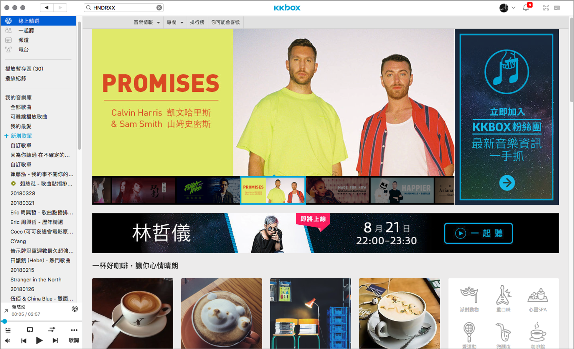
The legacy desktop interface that had remained unchanged for years.
Goal
I defined the following design goals to guide the project:
- Enhance the listening journey with a dedicated discovery hub and more personalized recommendations.
- Unify patterns and structure to reduce the learning gap between desktop and mobile.
- Rebuild the interface and define a desktop design system for consistency.
Process Overview
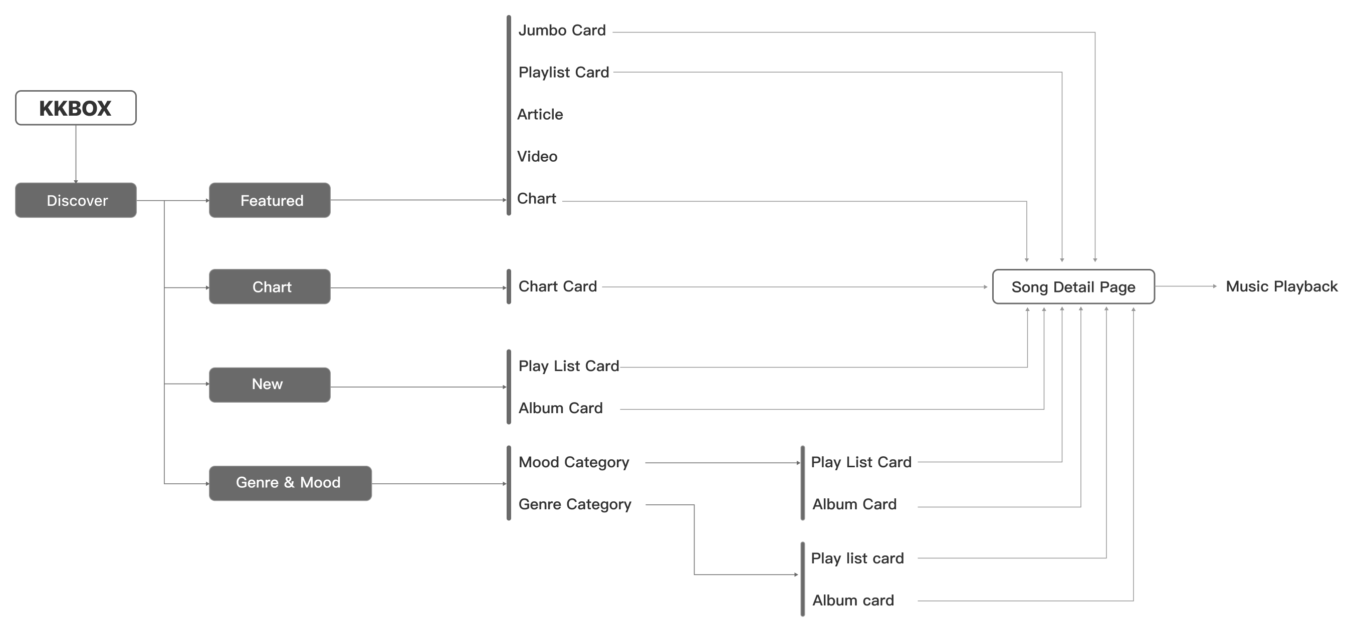
To clarify the structure of the desktop app, I created an information architecture map focusing on how users discover new music, browse playlists and albums, and access detailed song information.
This IA helped establish a clear navigation flow and maintain a consistent content hierarchy across different entry points.
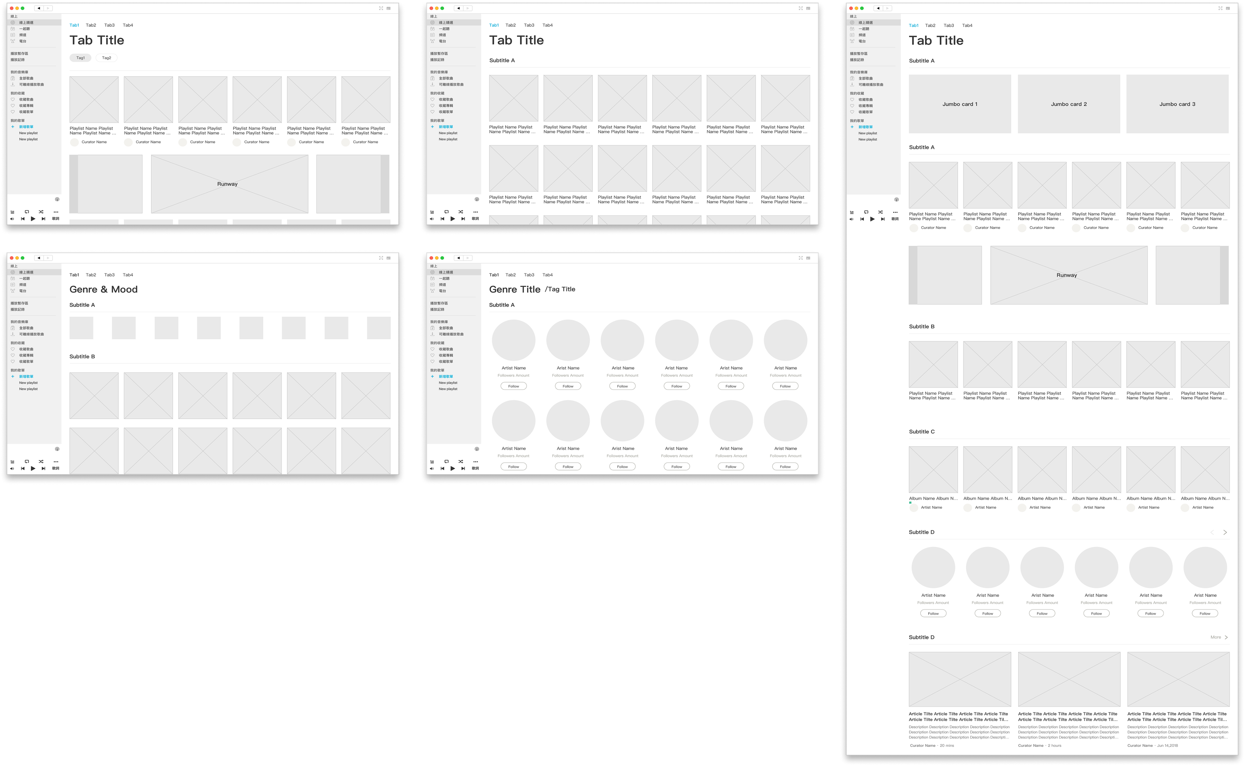
Based on user needs, product goals, and business requirements, I created a set of wireframes to explore how key features could be supported on the desktop platform.
These wireframes served as an early-stage discussion tool with the team to align on layout structure and ensure the design direction matched the overall product vision.
Design Outcomes
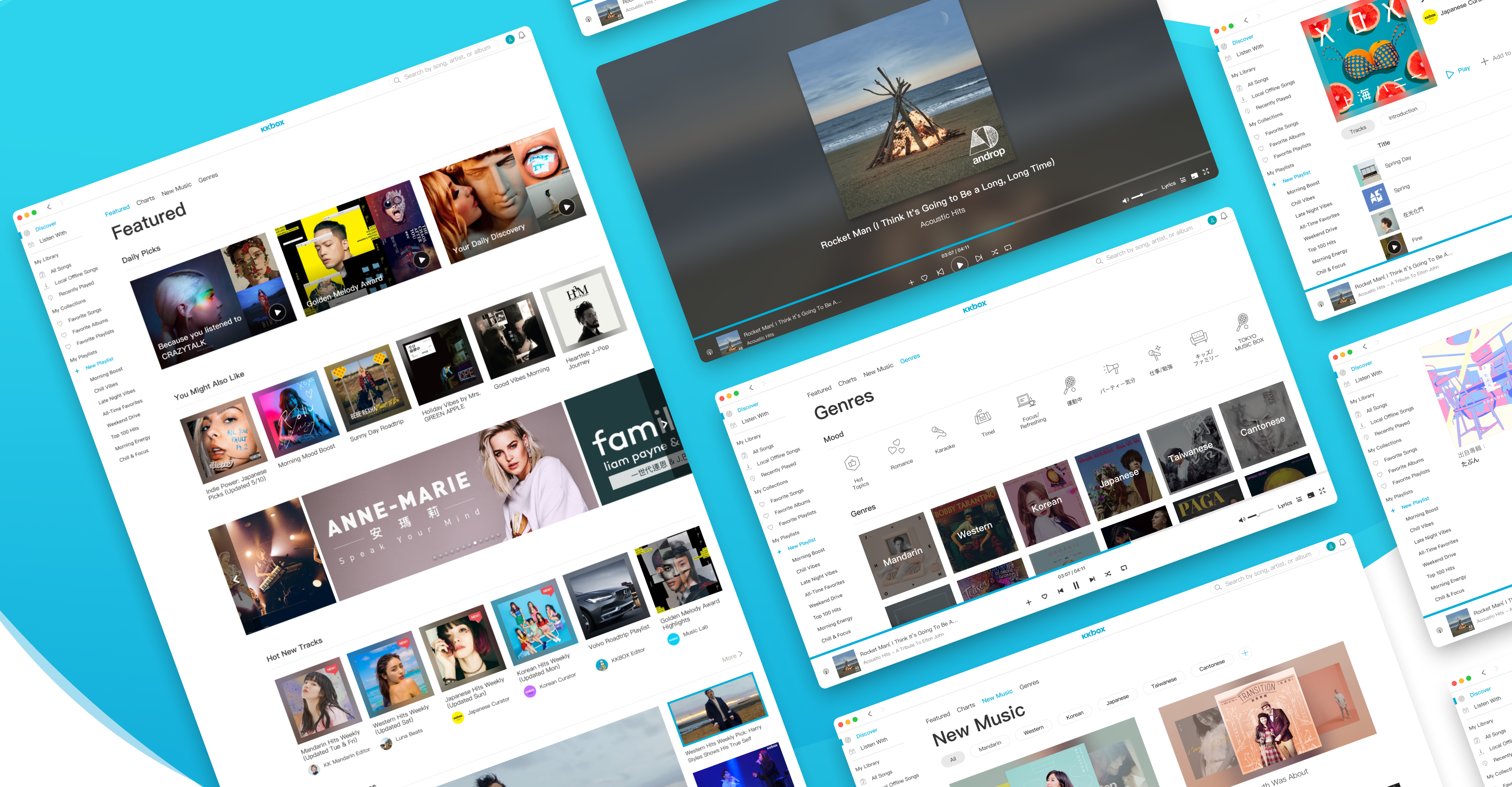
Building on the finalized wireframes, I developed high-fidelity mockups following the color palette and mobile design language. Real content and images were used to validate the design, with careful attention to multilingual adaptability and text-length variations across languages.
At the top, users are greeted with personalized playlists generated from their listening data, followed by additional recommendations such as trending songs, editorial articles, and video content.
Based on user insights showing a strong interest in popular music, many users discover songs through music charts. To support this behavior, a dedicated Charts tab was introduced within the Discover section, offering various rankings categorized by language and genre.
The New Music tab provides users with a comprehensive overview of the latest releases, while also serving as a space for promotional and partnership content to be featured.
The Genres tab enables users to explore music by style. I focused on creating a clean structure and consistent browsing flow to support different listening preferences.
Redesigned Playlist Page
Redesigned Song Page
Media Player
Based on user feedback about unclear playback information and confusing controls, I redesigned the desktop media player to deliver a more intuitive and consistent experience. It was built to support various listening scenarios, including standard playback, following DJs, and live broadcasting, with a scalable interaction pattern that adapts to each use case.
full-screen Player
A full-screen mode designed for an immersive listening experience, emphasizing album artwork while keeping essential playback controls accessible.
Impact
During my time on this project, several features had already been released, while others were still under active development. I worked closely with engineers to refine design details and ensure implementation quality.Even after my departure, the design foundation and desktop system I established continued to guide ongoing development.
© 2025 Mason Chang.
Revamping KKBOX’s Desktop App for Music Experience
Redesigned the desktop experience for KKBOX, a leading music streaming platform, with a new information architecture and unified design system to improve usability and visual consistency.

Overview
KKBOX is a Taiwan-based music streaming service with a strong presence in Asian markets. Its desktop app had not been updated for years, resulting in outdated navigation and a poor discovery experience compared to its mobile counterpart.
I led the end-to-end redesign by defining the UX direction, introducing a machine-learning powered desktop homepage aligned with mobile, rebuilding the IA from user pain points, and creating complete flows for discovery, song, album, playlist, and chart modules.
Working closely with web, macOS, and Windows engineers, I also established a desktop-specific design system that modernized the platform and provided a scalable foundation for future development.
My Role
- Took full ownership of the desktop revamp, defining the design vision and guiding the UX direction from research to final deliverables.
- Collaborated with PMs and engineering teams across web, macOS, and Windows to align business goals, user needs, and technical feasibility.
- Established a desktop-specific design system with reusable components and guidelines to ensure scalability and cross-platform consistency.
- Conducted user interviews and analyzed behavioral data to uncover pain points, translating insights into strategic design decisions.

Background
KKBOX was the leading music streaming platform in Taiwan, with over 56% market share at the time, and served millions of users across Hong Kong, Japan, Singapore, Thailand, and Malaysia.
While 87% of users accessed KKBOX via mobile and 64% on desktop, the desktop app had not been updated for years, leaving it outdated compared to the mobile experience. Lacking modern features and a cohesive system, the desktop experience gradually fell behind and accelerated the usage gap between mobile and desktop.
Problem
Based on previous user research and analysis, several pain points were identified:
- Lack of a dedicated discovery page and limited personalized recommendations.
- Significant differences between mobile and desktop experiences, creating a steep learning curve.
- Insufficient information display and unintuitive controls in the desktop player.

The legacy desktop interface that had remained unchanged for years.
Goal
I defined the following design goals to guide the project:
- Enhance the listening journey with a dedicated discovery hub and more personalized recommendations.
- Unify patterns and structure to reduce the learning gap between desktop and mobile.
- Rebuild the interface and define a desktop design system for consistency.
Process Overview
To clarify the structure of the desktop app, I created an information architecture map focusing on how users discover new music, browse playlists and albums, and access detailed song information.
This IA helped establish a clear navigation flow and maintain a consistent content hierarchy across different entry points.

Based on user needs, product goals, and business requirements, I created a set of wireframes to explore how key features could be supported on the desktop platform.
These wireframes served as an early-stage discussion tool with the team to align on layout structure and ensure the design direction matched the overall product vision.

Design Outcomes
Building on the finalized wireframes, I developed high-fidelity mockups following the color palette and mobile design language. Real content and images were used to validate the design, with careful attention to multilingual adaptability and text-length variations across languages.
At the top, users are greeted with personalized playlists generated from their listening data, followed by additional recommendations such as trending songs, editorial articles, and video content.
Based on user insights showing a strong interest in popular music, many users discover songs through music charts. To support this behavior, a dedicated Charts tab was introduced within the Discover section, offering various rankings categorized by language and genre.
The New Music tab provides users with a comprehensive overview of the latest releases, while also serving as a space for promotional and partnership content to be featured.
The Genres tab enables users to explore music by style. I focused on creating a clean structure and consistent browsing flow to support different listening preferences.
Redesigned Playlist Page
Redesigned Song Page
Media Player
Based on user feedback about unclear playback information and confusing controls, I redesigned the desktop media player to deliver a more intuitive and consistent experience. It was built to support various listening scenarios, including standard playback, following DJs, and live broadcasting, with a scalable interaction pattern that adapts to each use case.
full-screen Player
A full-screen mode designed for an immersive listening experience, emphasizing album artwork while keeping essential playback controls accessible.
Impact
During my time on this project, several features had already been released, while others were still under active development. I worked closely with engineers to refine design details and ensure implementation quality.Even after my departure, the design foundation and desktop system I established continued to guide ongoing development.
© 2025 Mason Chang. All Rights Reserved.
Revamping KKBOX’s Desktop App for Music Experience
Redesigned the desktop experience for KKBOX, a leading music streaming platform, with a new information architecture and unified design system to improve usability and visual consistency.

Overview
KKBOX is a Taiwan-based music streaming service with a strong presence in Asian markets. Its desktop app had not been updated for years, resulting in outdated navigation and a poor discovery experience compared to its mobile counterpart.
I led the end-to-end redesign by defining the UX direction, introducing a machine-learning powered desktop homepage aligned with mobile, rebuilding the IA from user pain points, and creating complete flows for discovery, song, album, playlist, and chart modules.
Working closely with web, macOS, and Windows engineers, I also established a desktop-specific design system that modernized the platform and provided a scalable foundation for future development.
My Role
- Took full ownership of the desktop revamp, defining the design vision and guiding the UX direction from research to final deliverables.
- Collaborated with PMs and engineering teams across web, macOS, and Windows to align business goals, user needs, and technical feasibility.
- Established a desktop-specific design system with reusable components and guidelines to ensure scalability and cross-platform consistency.
- Conducted user interviews and analyzed behavioral data to uncover pain points, translating insights into strategic design decisions.

Background
KKBOX was the leading music streaming platform in Taiwan, with over 56% market share at the time, and served millions of users across Hong Kong, Japan, Singapore, Thailand, and Malaysia.
While 87% of users accessed KKBOX via mobile and 64% on desktop, the desktop app had not been updated for years, leaving it outdated compared to the mobile experience. Lacking modern features and a cohesive system, the desktop experience gradually fell behind and accelerated the usage gap between mobile and desktop.
Problem
Based on previous user research and analysis, several pain points were identified:
- Lack of a dedicated discovery page and limited personalized recommendations.
- Significant differences between mobile and desktop experiences, creating a steep learning curve.
- Insufficient information display and unintuitive controls in the desktop player.

The legacy desktop interface that had remained unchanged for years.
Goal
I defined the following design goals to guide the project:
- Enhance the listening journey with a dedicated discovery hub and more personalized recommendations.
- Unify patterns and structure to reduce the learning gap between desktop and mobile.
- Rebuild the interface and define a desktop design system for consistency.
Process Overview
To clarify the structure of the desktop app, I created an information architecture map focusing on how users discover new music, browse playlists and albums, and access detailed song information.
This IA helped establish a clear navigation flow and maintain a consistent content hierarchy across different entry points.

Based on user needs, product goals, and business requirements, I created a set of wireframes to explore how key features could be supported on the desktop platform.
These wireframes served as an early-stage discussion tool with the team to align on layout structure and ensure the design direction matched the overall product vision.

Design Outcomes
Building on the finalized wireframes, I developed high-fidelity mockups following the color palette and mobile design language. Real content and images were used to validate the design, with careful attention to multilingual adaptability and text-length variations across languages.
At the top, users are greeted with personalized playlists generated from their listening data, followed by additional recommendations such as trending songs, editorial articles, and video content.
Based on user insights showing a strong interest in popular music, many users discover songs through music charts. To support this behavior, a dedicated Charts tab was introduced within the Discover section, offering various rankings categorized by language and genre.
The New Music tab provides users with a comprehensive overview of the latest releases, while also serving as a space for promotional and partnership content to be featured.
The Genres tab enables users to explore music by style. I focused on creating a clean structure and consistent browsing flow to support different listening preferences.
Redesigned Playlist Page
Redesigned Song Page
Media Player
Based on user feedback about unclear playback information and confusing controls, I redesigned the desktop media player to deliver a more intuitive and consistent experience. It was built to support various listening scenarios, including standard playback, following DJs, and live broadcasting, with a scalable interaction pattern that adapts to each use case.
full-screen Player
A full-screen mode designed for an immersive listening experience, emphasizing album artwork while keeping essential playback controls accessible.
Impact
During my time on this project, several features had already been released, while others were still under active development. I worked closely with engineers to refine design details and ensure implementation quality.Even after my departure, the design foundation and desktop system I established continued to guide ongoing development.
© 2025 Mason Chang. All Rights Reserved.